Data saves lives: dashboard provides clearer, real-time information on the spread of the coronavirus
#Operations #Dashboard with #ESRI #ArcGIS #Enterprise on #Wuhan #SARSCoV2 #Coronavirus #2019nCoV in #near #realtime as #Tracking #Map for #Germany #Europe #World link #WHO Public Advisory and #BMG Meldungen @ #fraunhofer #iao #universitystuttgart #iat Dashboard LINK - IAO Blog Daten retten Leben
The spread of the coronavirus has been developing at an alarming rate in recent weeks. Until mid-March, most of us did not realize how serious the situation is. However, the data that could have predicted its current development was available to some extent. According to L.Gardner and colleagues from the Johns Hopkins University (JHU Blog), on December 31, 2019, the World Health Organization (WHO) was informed of an outbreak of "pneumonia of unknown cause" in the city of Wuhan, Hubei Province, China. The dashboard, first published on 22 January 2020, shows the location and number of confirmed, deaths, and recovered COVID-19 cases for all affected countries.
Getting a clearer picture of the pandemic and predicting how it will unfold is just a question of using freely available data and a powerful Geographic Information System (GIS) that is capable of processing and visualizing (real-time) data. Unfortunately, there continues to be a lack of clarity about how the data is presented, as discussed by an article published in the Stuttgarter Zeitung on March 28, 2020, entitled “The virus figures in real-time display” (»Die Viruszahlen im Echtzeitblick«). Although, as in other instances, this article cites well-known and reliable sources of data (e.g. JHU) a more consolidated overall view and display of the data was missing.
Operations dashboard: tracking the spread of coronavirus in real-time
Geo-information, available and obtainable from reliable and accurate geographic data from many different sensors and systems plays is an important source for authorities on municipal, state, federal, and international level, to make better-informed decisions. Combined or matched with scientifically sound knowledge and expertise, offered by, for instance, virologists and other medical experts in the coronavirus crisis, it helps everyone to be properly and adequately informed. This is how it should be in everyday life. In the current situation, it helps citizens to be informed and enables authorities and politicians for more well-informed and transparent decision-making.
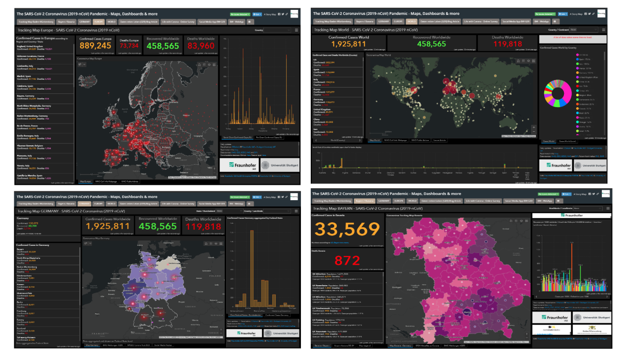
Therefore, I have taken the coronavirus crisis as an opportunity to collect, aggregate and illustrate relevant and real-time or near real-time data available to me. The data collected and put to use and some of its parameters are visualized on maps with different scales that users can track the spread of the Coronavirus Sars-CoV-2. The dashboards are grouped and summarized in a so-called StoryMap and contain the distribution and visual interpretations for Baden-Württemberg, Bayern (Bavaria), Germany, Europe, and the whole world. Cases officially reported by German and international authorities are shown as polygons (choropleth map display) or circles (symbol map display) on a bivariate bubble map. These are divided into three categories: (1) confirmed cases, (2) recovered and (3) deaths. The size of the circle symbols and the degree of shading indicate the total number of cases.

References: The real-time SARS-CoV-2 coronavirus pandemic dashboard includes many interactive maps as well as information sources and visualizations on municipal, regional, national, EU and global levels. Data and sources of the online dashboard: JHU, WHO, CDC, ECDC, NHC and DXY, health ministries of Germany’s federal states, data, #RKI, #BMG #LGL © Fraunhofer IAO/Stuttgart University (JHU 2020).
Confirmed cases include all reported cases in the respective city, county or state. The total number includes all current and former ill, i.e. infected and dead persons. For all regions, i.e. Baden-Württemberg, Bayern (Bavaria), Germany, Europe and the World, ranking lists are included, sorted by case figures to show the most affected places or people. The sum of confirmed cases is visualized in a bar and pie chart with additional information for Germany’s southern states. The visualizations and additional information help understand the pattern and rapid distribution of the virus. Additional visualizations could be added, such as the timeline in the form of a chronological progression or else.
Dynamic data and information levels due to various reporting chains
In some cases, official infection figures published by German authorities (e.g. the Robert Koch Institute, or “RKI”) differ from those reported by the individual health ministries of the federal states or the JHU. The RKI publishes its figures also via the dashboard made available by ESRI Deutschland with a moderate delay of up to two days, while in some cases it takes about half a day for some health ministries to publish their figures. The figures of the Johns Hopkins University (JHU) also differ slightly, but these are also requested and obtained by the state authorities. Why do the numbers or figures differ? The reasons for this are the different reporting periods, the resulting different status of the figures and the corresponding dynamics of the respective reporting chains. Data from known cases are often reported with delay to higher-level authorities because there is no common and centralized data infrastructure. Thus, the exchange of information and data between institutions and authorities seems cumbersome. There certainly is room for improvement where data handling and streaming could be substantially improved between (public) institutions.
Reality check: open data & GIS in the 21st century
No longer can we afford not to make use of the data at hand. Only by successfully integrating, illustrating and visualizing data and information available to everyone, we can learn and enhance our understanding of the world around us, optimize and improve processes and our livelihood as such. This should not only happen when a crisis needs to be tackled but way earlier, before any crisis (e.g.Climate Change) happens.
>> It is not enough to respond to crises. We need to take action before they happen!<<
In the 21st century, I believe that it is essential for authorities, organizations and institutions, in business, politics and education, to learn and know about the data is available and how to adequately apply it for the greater good. A lot of data that could help improve our daily lives is often kept hostage by authorities or companies and usually made only available to those that can afford to spend large sums of money through often time-consuming procurement procedures and processes. This is not only inefficient but also costly in terms of data storage and hosting. Data as such that does usually not cause specific GDPR risks, which is mostly related to personal data processing, but it should be cautiously prepared with the support of experts and made available to the public transparently and comprehensively. This is particularly important for education in schools and universities, work conducted at research institutions, but also for the public at large where people do not enjoy regular access to these resources.
However, making trustworthy data available while anticipating the dynamic changes in this availability and data enrichment through data sharing, especially between experts and professionals, is becoming increasingly important. This is especially true as we are moving toward a data-driven society, where data is being used - or sadly misused - in all spheres of life for new insights in the information age, together with amazing and impressive computing technologies within reach.
The current lock-in of data cannot be the ultimate solution. Still, the absence of crucial data that is yet to be collected and dispersed as the numbers displayed in the dashboards, poses an even greater problem or threat to fully understand the situation. The lack of data and information distorts the entire picture and could eventually cause undesirable, negative political, economic or societal consequences because of uninformed decision-making. This is particularly true for the current virus crisis. The figures presented show only one side, missing other pieces of the puzzle that is indeed greater and more complex as some might anticipate. We must always remember that the figures presented are not complete, and should be explored and interpreted with a pinch of salt.
Data transparency and reliability: Lessons learned from COVID-19?
As in the case with the coronavirus crisis, national and international cooperation has a fundamental role to play in fully overcoming this crisis, and indeed any other unexpected crises that we may face in the future. Reliable evidence can provide new insights, at least in the cautious use and form of consolidated data or data services. GIS applications and systems can help to create invaluable interfaces between citizens and administrations. Access to and real-time display of comprehensibly prepared data by experts create a benefit for society as a whole. I am sure that the lessons we have not learned from previous situations, or skills acquired through consequences in past crises, we shall learn from this one or another crisis in the future. I trust that building a sustainable data-democracy and reliable data infrastructure across institutes may be a positive consequence of this situation. Because what applies during a crisis is of equal importance in everyday life, to be better prepared for the next crisis we may face, and possibly save more lives.
Let me know if you have any questions or comments. Feel free to get in touch via email.
Further reading
Link to the Fraunhofer IAO web-based coronavirus dashboard
Link to Fraunhofer IAO GIS Enterprise PORTAL
Fraunhofer IAO Blog: Daten retten Leben – Corona-Ausbreitung endlich verständlich und in Echtzeit, March 30, 2020
The related web-based dashboard on the blog by Johns Hopkins University.
Professor Lauren Gardner in a YouTube video discussing the dashboard built by Johns Hopkins University.
Article: Stuttgarter Zeitung on March 28, 2020, entitled “Die Viruszahlen im Echtzeitblick” (“The virus figures in real-time display”).
Article: A fiasco in the making? As the coronavirus pandemic takes hold, we are making decisions without reliable data, by John P.A. Ioannidis / March 17, 2020
Article: „Solchen Wissenschaftlern würde ich gerne Kamera oder Mikrofon entziehen“ – Gesundheitsstatistiker Gerd Bosbach zur Corona-Debatte. March 27, 2020
Bericht zur Risikoanalyse im Bevölkerungsschutz 2012 vom 3.1.2013: http://dipbt.bundestag.de/doc/btd/17/120/1712051.pdf
NPGEO Corona Hub 2020, Nationale Plattform für geografische Daten
Credit goes to the JHU Data Services and the Johns Hopkins Coronavirus Resource Center, where JHU experts help promote a broader understanding of the virus, inform the public and policymakers, improve care and save lives. Further acknowledgement goes to the colleagues from SWR and LGL Bayern for sharing data on their webpages.
This dashboard/website and its contents, including all mapping, and analysis ("Website"), copyright 2020 Fraunhofer IAO - Stuttgart University, all rights reserved, is provided to the public strictly for educational and academic research purposes. The dashboard and information rely upon publicly available data from multiple sources that do not always agree. Reliance on the dashboard/website for medical guidance or use of the Website in commerce is strictly prohibited.
Digital Transformation with Esri 🌍 I Digital Sales Leader 💶 I Social media enthusiast in the GIS Sector 🗺️ I Sharing my knowledge in ArcGIS 🌐 I Dedicated volunteer in my hometown 🤝
4yGreat read. Shared it in my network 👍